Checkbox Widget (Themable)
 |
This themable widget was listed as Beta in the ThingWorx 8.4 X release.
|
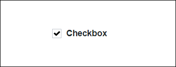
The Checkbox widget enables you to add a checkbox to your mashup and allow a user to select the checkbox option.
|
|
The Checkbox widget is available as a standard widget in the platform and as a web component that can be imported from an SDK.
|
The properties of the checkbox widget are listed below.
|
Property Name
|
Description
|
Base Type
|
Default Value
|
Bindable? (Y/N)
|
Localizable? (Y/N)
|
||
|---|---|---|---|---|---|---|---|
|
State
|
Enables you to set the state of the checkbox widget, as selected or not selected.
|
BOOLEAN
|
False
|
Y
|
N
|
||
|
Disabled
|
Use this property to disable the checkbox widget in the mashup. The widget is displayed but you cannot click it in the mashup.
|
BOOLEAN
|
False
|
Y
|
N
|
||
|
PartialState
|
Enables you to have a parent checkbox in a partially checked state,  . . |
BOOLEAN
|
False
|
Y
|
N
|
||
|
Label
|
The text that is displayed in the widget near the checkbox.
|
STRING
|
Checkbox
|
Y
|
Y
|
||
|
CustomClass
|
Enables you to define the CSS to the top div of the widget. Multiple classes can be entered, separated by space.
|
STRING
|
n/a
|
Y
|
N
|
||
|
LabelMaxWidth
|
Enables you to set a maximum width for the label and the label is displayed in multiple lines when the maximum width is reached.
|
NUMBER
|
n/a
|
N
|
N
|
||
|
TabSequence
|
The sequence in which widgets are highlighted when a user presses Tab key.
|
NUMBER
|
n/a
|
N
|
N
|
||
|
Changed
|
The event that is triggered when the state of this widget is modified.
|
n/a
|
n/a
|
Y
|
N
|
||
|
ResetToDefaultValue
|
Resets the inputs for this widget to its default values.
|
n/a
|
n/a
|
Y
|
N
|
||
|
Width
|
The width of the widget. The width is set to the width of the label by default. Enter a value in the property panel or resize the widget in the canvas to set a fixed width.
|
NUMBER
|
n/a
|
N
|
N
|
||
|
Height
|
The height of the widget. The height is set to the maximum width of the label by default. It increases if the widget has multiline label. Enter a value in the property panel or resize the widget in the canvas to set a fixed height.
|
NUMBER
|
n/a
|
N
|
N
|