Button Bar Widget
 |
The Radio Button widget was renamed the Button Bar widget for ThingWorx 8.4.x and later versions. There is a new Radio Button Widget that is available for ThingWorx 8.4.x and later versions.
|
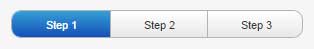
The Button Bar widget is a multi-option select button. Only one button, or state, can be selected at a time. The Button Bar is an input control, so the designed use is to set a value based on the user selection.
The possible selections are configured by assigning a state definition by selecting one of the defined states in the mashup environment. For example, if you have three running conditions for a motor (On/Off/Auto) and you want an operator to set the running condition, you can define a state definition with those three states. Then, that state definition can be used whenever you want to have an On/Off/Auto button on a mashup.
Each of the states in the state definition will be automatically linked to a single button in the button group. The displayed text will be the display string from the style associated with each individual state, and will be shown in the color scheme of the corresponding style.
There are SelectedText and a SelectedValue properties so you can have an index, a text output, or both.
|
|
Styles and common widget properties are not included in the table below. They are described in the Widgets topic.
|
|
Property Name
|
Description
|
Base Type
|
Default Value
|
Bindable? (Y/N)
|
Localizable? (Y/N)
|
|---|---|---|---|---|---|
|
CustomClass
|
User defined CSS class to apply to the top div of the widget. Multiple classes can be entered, separated by a space.
|
STRING
|
n/a
|
Y
|
N
|
|
Orientation
|
How the buttons should be aligned (Vertical or Horizontal).
|
STRING
|
Horizontal
|
N
|
N
|
|
SelectedValue
|
The Get or Set value that drives the state.
|
STRING
|
n/a
|
Y
|
N
|
|
SelectedText
|
Get or set the name of the selected state.
|
STRING
|
n/a
|
Y
|
N
|
|
ReadOnly
|
If set to true, the button bar only displays the current state and cannot be clicked.
|
BOOLEAN
|
False
|
N
|
N
|
|
ButtonStates
|
Choose a state definition and the button bar will auto-populate the buttons with the state names and values.
|
STATE DEFINITION
|
n/a
|
N
|
N
|
|
SelectionChanged
|
An event is triggered whenever the selected button changes.
|
n/a
|
n/a
|
Y
|
N
|