Custom CSS Tutorial
Prerequisites
Before you begin, perform the following steps:
• Make sure you are using ThingWorx 8.4
• Download the Sample Tutorial Files
• Import the following sample files into the ThingWorx platform:
◦ Mashups_CustomCssTutorialMashup
◦ Things_SampleCssFileRepo
Uploading a Custom CSS File to a ThingWorx Repository
1. In Composer, click Manage in the left navigation pane.
2. Under Repositories, select the SampleCSSFileRepo repository. All files and folders that are under the repository are listed.
3. Under Actions for the SampleCSSFileRepo folder, click the ellipsis (...) and then select Upload. A dialog box opens.
4. Select the tutorial-buttons.css from your system, and then click Upload.
The CSS file is uploaded to the SampleCSSFileRepo Thing repository.
Adding a Custom CSS Class to a Mashup
1. Open the Mashups_CustomCssTutorialMashup mashup in Mashup Builder, and then click View Mashup. The mashup consist of a set of buttons in a Fieldset to which CSS rules are applied.
2. On the Explorer panel, select Mashup.
3. On the Properties panel, add myMashupClass to the CustomClass field.
4. Click the Custom CSS tab and enter the following CSS code:
.myMashupClass .widget-fieldset .widget-button {
box-shadow: 5px 5px 5px #888888;
}
box-shadow: 5px 5px 5px #888888;
}
5. Click Save, and then view the mashup. The drop shadows appear for the buttons in the Fieldset widget.
Adding Custom CSS to a Mashup
1. On the Explorer in panel in Mashup Builder, select button-3.
2. On the Properties panel, add myButtonClass to the CustomClass field.
3. To add a CSS rule block, click the Custom CSS tab and enter the following CSS code:
.myButtonClass .widget-button .widget-button-text {
text-transform: uppercase;
}
text-transform: uppercase;
}
4. Click Save, and then view the mashup. The second button still has the drop shadow, but the text appears in uppercase.
Binding the Widget CustomClass Property
1. In Mashup Builder, open the Explorer panel and select eventsrouter-6.
2. Bind the output from eventsrouter-6 to the CustomClass of button-4.
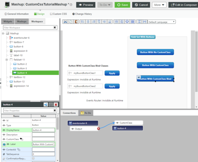
3. Click the Custom CSS tab and enter the following CSS code:
.myButtonClass .widget-button .widget-button-text {
text-transform: uppercase;
}
.myBoundButtonClass1 .widget-button,
.myBoundButtonClass1 .widget-button .button-element {
border-radius: 15px 0 15px 0;
}
.myBoundButtonClass2 .widget-button,
.myBoundButtonClass2 .widget-button .button-element {
border-radius: 0 15px 0 15px;
}
text-transform: uppercase;
}
.myBoundButtonClass1 .widget-button,
.myBoundButtonClass1 .widget-button .button-element {
border-radius: 15px 0 15px 0;
}
.myBoundButtonClass2 .widget-button,
.myBoundButtonClass2 .widget-button .button-element {
border-radius: 0 15px 0 15px;
}
4. Click Save, and then view the mashup.
5. Click the first Apply button to add myBoundButtonClass1 to the third button within the Fieldset widget, and then click the second Apply button. The button border radius changes based on which CSS class is applied.
Importing a Custom CSS file
The following procedure covers importing a CSS file from a ThingWorx repository. The file applies animation and opacity changes to the Button widgets within the Fieldset widget:
@keyframes buttonSlideIn {
0% { left: 100px; opacity: 0 }
100% { left: 0; opacity: 1 }
}
.widget-fieldset .widget-button {
animation: buttonSlideIn 2s;
opacity: 0.5;
}
.widget-fieldset .widget-button:hover {
opacity: 1;
0% { left: 100px; opacity: 0 }
100% { left: 0; opacity: 1 }
}
.widget-fieldset .widget-button {
animation: buttonSlideIn 2s;
opacity: 0.5;
}
.widget-fieldset .widget-button:hover {
opacity: 1;
1. In Composer, click the Custom CSS tab and enter the following CSS code:
@import url("/Thingworx/FileRepositories/SampleCssFileRepo/tutorial-buttons.css");
2. Click Save, and then view the mashup. The buttons animate, moving in from the right and fading in. Once the animation is complete (2 seconds), the buttons are 50% opaque until you rollover the buttons.