Customizing Chart Labels
You can customize the labels on different types of chart elements, such as the:
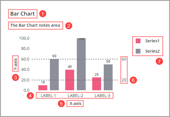
1. Chart Title
2. Notes
3. Vertical axis title
4. Horizontal or vertical axis tick markers
5. Horizontal or vertical axis labels
6. Reference lines
7. Legend
Customizing the Chart Title
1. Select a chart widget on the canvas or using the Explorer panel.
2. On the Properties panel, use the following properties to configure the title:
◦ Label—Sets the text to display as a title. Click to select a localization token on the server.
◦ LabelAlignment—Aligns the label to the right, left, or center of the chart.
◦ LabelPosition—Controls whether the label is displayed at the top or bottom of the chart.
◦ LabelType—Sets the label size and style using a list of predefined options.
3. Click Save.
Adding Notes to a Chart
Each chart widget includes a notes area that you can use to add a short description or context about the information that is displayed on the chart. To add notes to a chart:
1. Select a chart widget on the canvas or using the Explorer panel.
2. On the Properties panel, use the following properties to configure the notes area:
◦ Notes—Sets the text to display within the notes area. Click  to select a localization token.
to select a localization token.◦ NotesAlignment—Aligns the note text to the right, left, or center of the chart.
◦ NotesPosition—Controls whether the notes area is displayed at the top or bottom of the chart.
3. Click Save.
Customizing the Axis Labels
1. Select a chart widget on the canvas or using the Explorer panel.
2. On the Properties panel, use the following properties to configure the axis label area:
For Bar, Line, Waterfall, and Pareto Charts, use the following properties on the Properties panel:
◦ XAxisLabel—Sets the X-axis label.
◦ XAxisLabelAlignment—Aligns the X-axis label to the left, right, or center.
◦ YAxisLabel—Sets the Y-axis label.
◦ YAxisLabelAlignment—Aligns the Y-axis label to the left, right, or center.
For Schedule Chart, use the following properties on the Properties panel:
◦ ResourceAxisLabel—Sets the Resource axis label.
◦ ResourceAxisLabelAlignment—Aligns the Resource axis label to the left, right, or center.
◦ TimeAxisLabel—Sets the Time-axis label.
◦ TimeAxisLabelAlignment—Aligns the Time axis label to the left, right, or center.
To configure axis labels on charts with a secondary Y-axis, use the SecondaryYAxisLabel and SecondaryYAxisLabelAlignment properties.
3. Click Save.
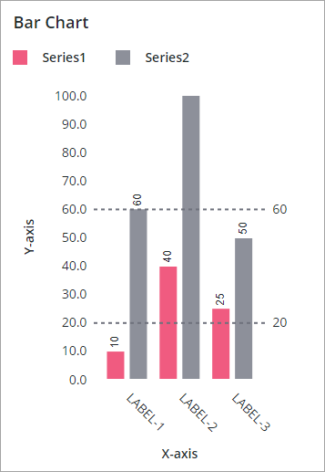
Rotating Data Labels on the Horizontal Axis
By default, when the chart is displayed in a small container, labels on the horizontal axis are automatically rotated 90 degrees.
You can use the HorizontalAxisLabelsRotation property to rotate labels for the tick markers on the horizontal axis at a custom angle. When you set a custom angle, automatic rotation based on the available space is disabled. Tick marker labels are shortened to prevent overlap when long labels are displayed at an angle of 0, 180, or –180 degrees. However, labels may overlap when the rotation is small, such as 5 or 10 degrees. To avoid truncated text, use the NumberOfXLabels property to reduce the number of labels on the axis. To rotate the labels on the horizontal axis:
1. Select a chart widget on the canvas or using the Explorer panel.
2. On the Properties panel, set the HorzLabelsRotation property to a value between –180 and 180 degrees to specify the rotation angle. The widget preview on the canvas is updated.
Optionally, adjust HorizontalAxisMaxHeight property to fit the labels when they are rotated.
3. Click Save to save the changes to the mashup.
The horizontal axis labels are rotated on the canvas and at run time. When horizontal space is not available, the full labels are displayed using the vertical space in the layout. The following image shows a Bar Chart widget with the labels rotated to 45 degrees.
Customizing Reference Line Labels
To change the label to display next to each reference line on the chart:
1. Select a chart widget on the canvas or using the Explorer panel.
2. On the Properties panel, type or bind a string, or select a localization token for each ReferenceLineNLabel property.
3. Click Save to save the changes to the mashup.
For more information about reference lines, see Adding Reference Lines to a Chart.
Formatting the Axis Data Labels
You can format labels of chart axes manually for each chart that supports multiple data types using axis format properties, such as YAxisFormat and XAxisFormat.
The following data types support formatting:
• Numbers—Define a numeric pattern to control the number of characters to display after the decimal point.
• Dates—Format the date using DD-MM-YY formatting options. For more information. see Formatting Date and Time for Widgets.
Customizing Data Series Labels in the Legend Area
The legend area displays information about the data series names on the chart. By default, the infotable field names are used to display labels in the legend. You can customize the legend label, color, and more. For more information, see Customizing the Chart Legend.
You can use widget properties to customize the series names for all charts, except for the Schedule Chart. To customize the data series labels for the Schedule Chart, edit the infotable data source that contains a list of resources and events.