Editing Data within the Grid Widget
To enable editing within the grid widget, perform the following steps:
1. In Mashup Builder, select the Grid widget on the canvas or using the Explorer panel.
2. On the Properties panel, set IsEditable to True, and then click  to open the widget configuration dialog box.
to open the widget configuration dialog box.3. In the left pane, choose a column, then on the right pane, select the Editable check box.
Optionally, configure the following options:
◦ Select the Required check box to always require a value when editing the cell content.
◦ Define a validation expression in the Validation Expression box to apply validation rules to the cell content.
◦ Define the messages and details to display for the validation.
4. Repeat the previous step for any column that you want to edit.
5. Click Done to close the dialog box, and then save the mashup.
Choosing an Editing Mode
To control how you can edit the grid at run time, set the widget EditLevel property to one of the following options:
• Entire Grid—Edit individual cells and save the changes manually using a button or a service.
• Single Row—Edit rows individually using a form.
• Single Cell—Edit cells individually and save the changes automatically when an edit is done.
As you make edits to a column that has validation enabled, the input is evaluated to make sure the data you entered is valid. When the validation fails, an error message is displayed and the changes are not saved. For more information about validation, see Validating Input within the Grid.
You can also enable the EditButton property instead of the IsEditable property. If you set this property to true, an edit button is added to the grid toolbar. You can click the button at run time to turn the editing mode on or off.
Grid Edit Mode
The grid edit mode allows you to update multiple cells and then click a Save button to save all of the changes at the same time.
The following image shows the edit buttons in the top-left area of the widget at run time when editing the entire grid.
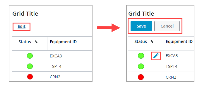
When you click Edit, the Save and Cancel buttons are displayed. Edit controls are displayed for each cell that has editing enabled on the grid. You can edit data for one or more cells, and then click Save to save the edits. To highlight cells that contain unsaved edits, set the HighlightDraftState property to True. A different background color is used to indicate cells with edits.
The following edit events are available for this mode:
• EditStarted—Triggers you click the Edit.
• EditCompleted—Triggers when you click Save.
• EditCancelled—Triggers when you click Cancel.
Row Edit Mode
Row editing enables you to edit one row at a time. When you enable this mode, a column that contains edit controls is added to the left side of the gird. The following image shows the grid widget set to row editing mode.
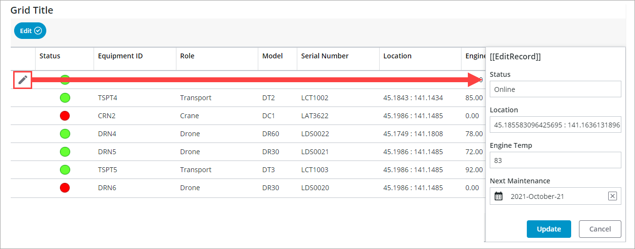
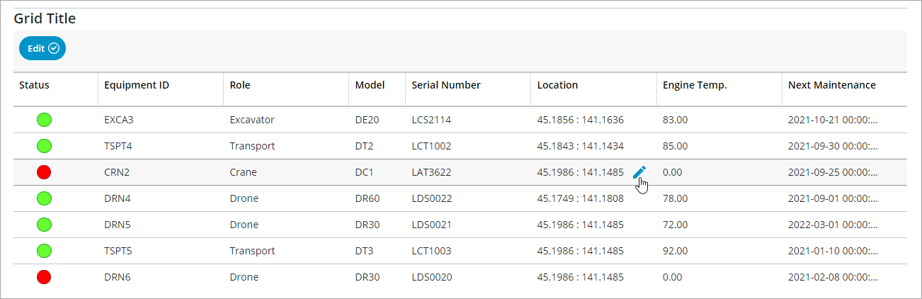
To edit a row, click the edit icon or link. An edit form that contains the cells within the row is displayed. After making edits to the values, click Update to save any changes to the current row.
The following edit events are available for this mode:
• EditRowStarted—Triggers you click the edit icon or link to start editing a row using the form.
• EditRowCompleted—Triggers when you click Update.
• EditCancelled—Triggers when you click Cancel.
Cell Edit Mode
The following edit events are available for this mode:
• EditCellStarted—Triggers you click the edit icon or link to start editing a cell.
• EditCellCompleted—Triggers when you press the ENTER key or click outside the cell after changing the value.
• EditCancelled—Triggers when you cancel the cell edit.
You can edit a cell by clicking its edit icon or link. When the edit box is active, the raw value is displayed without any formatting. After you finish the edit, the column renderer is applied to format the value. For more information about renderers, see Grid Column Renderers and Formats.
 | To cancel an edit without saving your changes, press the ESCAPE key. |
Configuring the Edit Controls
Use the EditControlType property to display an icon or a link for the edit control. You can replace the icon with any media entity on the server using the EditControlIcon property. To change the default edit label for the link, use the EditControlLabel property. By default, edit controls are displayed when you place the pointer on an cell. You can configure the visibility of the edit controls using the EditControlVisibility property.
Enabling Editing using JSON Configuration Data
To enable editing for a column, add the following JSON data:
...
“ColumnFormatter”: {
“type”: “boolean”,
“format”: “notext”,
“cellEditor”: {
“enabled”: true, // *{boolean} to indicate whether cell editing is enable for this column
},
}
...
“ColumnFormatter”: {
“type”: “boolean”,
“format”: “notext”,
“cellEditor”: {
“enabled”: true, // *{boolean} to indicate whether cell editing is enable for this column
},
}
...