Configuring Data Selection
The Grid supports single and multiple row selection modes based on the configuration of the RowSelection widget property. By default, row selection is disabled. You can pass the selected data rows to other widgets or data services in a mashup using the SelectedRows and the LastClickedRow widget properties. For example, you can pass data rows for display in a Line Chart widget. You can also use the properties as input for a data service. You can configure selection on the Properties panel of the Grid widget at design time. The Grid supports single selection using direct clicks, or multiple selection using a row selection column.
No Selection (default)
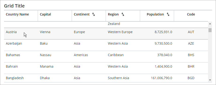
By default, data selection in the Grid widget is disabled and only a hover state is indicated when a user clicks on a row to select it.
Single Row Selection
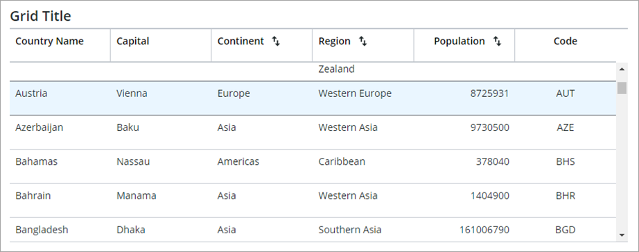
Use single selection to allow users to select one row on the grid. You select a row by clicking any cell within the row. Selected rows are highlighted using a specific color. You can change this color in the grid style properties or using the style theme. The selected row is stored in the SelectedRows widget property as an infotable.
 | The SelectedRows property includes data from excluded columns on the grid. |
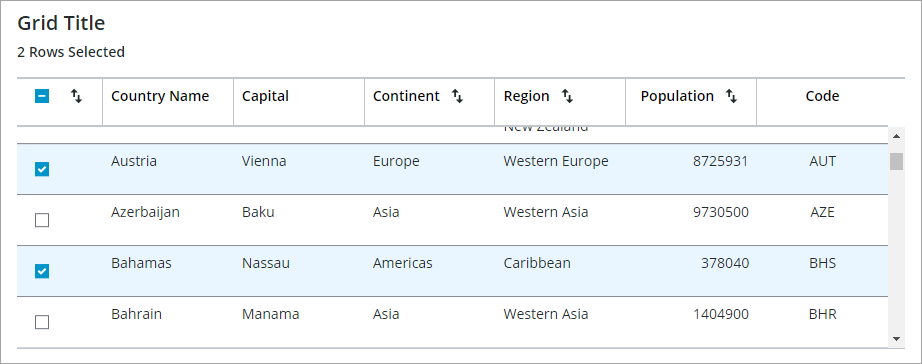
Multiple Row Selection
When multiple selection is enabled, a selection column is added to the left of the grid data. You can use the check box on the header row to select all data within the Grid, or any check box next to a row to select single rows. To sort the grid data by the selection state, click the sort button in the column header.
Preselecting Rows
You can specify which data rows on the grid are selected by default when the grid is displayed at run time using one of two widget properties:
• DefaultSelectedRows—Preselects data rows on the grid by typing or binding a value that specifies a range, such as 2–5, or a comma-separated list of numbers, such as 2,3,6. This property is applied to the tree grid in ThingWorx 9.4.1 or later.
• SelectedRows—Preselects data by passing an infotable with the data rows to select. For example, you can pass the Selected Rows output property of a data service for a Bar Chart to the SelectedRows input property of a grid widget. Any selections on the chart are highlighted on the grid.
| | These properties do not affect selection when the RowSelection property is set to None. To select one or more rows, you must set the RowSelection property to Single or Multiple. |
In ThingWorx 9.3.4 and later, you can configure selection on the tree grid using the following properties:
• SelectFocuedItem—Selects focused rows or cells automatically when the focus box is moved. You can use the FocusNavigationMode property to configure the element to focus on when moving the focus box.
• IDPathSeperator—Sets the special character to use when selecting rows that are loaded dynamically. You can provide an ID path to a row under the id column. The default separator is :;
Selecting Dynamically Loaded Rows in the Tree Grid
To expand and select rows in a Tree Grid that are not loaded on the client yet, provide an infotable with at least an id column indicated by the IDFieldName property that contains the full path of row IDs to the selected row. By default, the :; character combination is used as the path separator, but you can change it by setting the IDPathSeparator property in Mashup Builder or in the JSON configuration file.
For example to select a row with ID ddd, create an infotable with a column with ID value:
//aaa:;bbb:;ccc:;ddd.
By default, only the child ID is passed to the SelectedRows infotable when a child row is selected. To include the full ID path of a selected child, set the IncludeRowExpansionParents property to true. When the infotable for the selected rows is sent to the grid and a listed row is not yet loaded by the grid, the Tree Grid automatically generates a request to the bound data service.
Disabling Rows on the Grid
You can add an infotable column to the grid data that controls the disabled of each row on a grid. To disable data on the grid, perform the following steps:
1. On the Properties panel, set AllowDisabledNodes to true.
2. Select the infotable column with the data for the disabled state using the DisabledStateField property.
To disable the child rows under a disabled parent row in a tree grid, enable the DisableChildNodes property.
3. Click Save, then view the mashup.
The disabled state data is applied to rows at run time.
Passing Selected Data
You can use the SelectedRows property of the Grid to pass the selected data on the Grid when row selection is set to Single or Multiple. This property has a two-way binding direction. You can bind the property as an output or an input. Use an output binding to pass the Grid selection to another data service or widget, or as an binding input to control the row selection using a widget or a data service. To pass data from a Grid where row selection is disabled, use the LastClickedRow infotable property. This property has an out binding direction only, and you can use it to pass the infotable data of the last clicked row on the Grid.
Responding to Row Selection Events
When a user selects or clicks a row at run time, the RowClicked event is triggered. An additional SelectedRowsChanged event is generated when single or multiple selection is enabled. You can use one of these events to execute data services or services within functions and widgets.