Configuring the Combo Chart
Setting the Z-Index Value of Series Data
By default, the stacking order of the chart data is based on the data series type. The following is the default order for each type from low to high:
1. Bar
2. Area
3. Line
4. Step
5. Marker
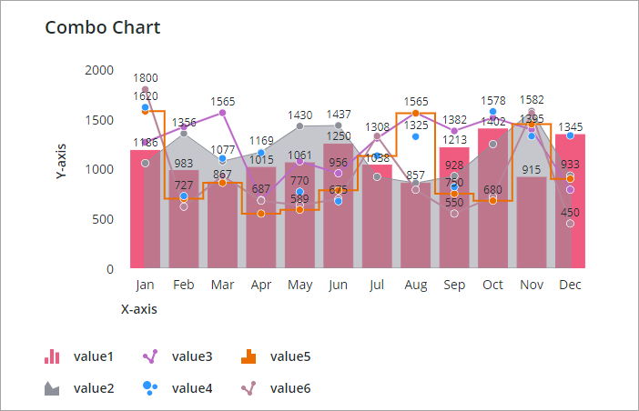
You can use the SeriesZIndex to configure the stacking order of data series on the chart. A series with a higher index value is displayed in front of other series with a lower value.
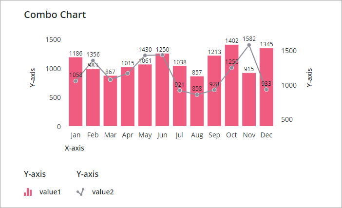
Applying Minimum and Maximum Values
By default, the combo chart displays minimum and maximum values for the Y-axis scale based on the bound data. You can specify custom minimum and maximum values to display on each Y-axis using the YAxisNMinimumValue and YAxisNMaximumValue properties. For example, the following chart shows a combo chart with two Y-axes. The first axis scale has a range of 0–1500 and the second axis has a range of 500–1500.
Setting a Maximum Width for the Y-Axes
You can display up to 24 separate Y-axes on the Combo Chart widget. Showing multiple axes takes up additional space in the layout, which can affect the visibility of the data. To restrict the secondary Y-axis area to a specific width, use the YAxesMaxWidth property. A scroll bar is displayed when the space required to display the Y-axes exceeds the available width.

Aligning Bars on Multiple Y-Axes at Zero
It can be difficult to compare data within grouped bars on the chart when the scales are different. You can enable the AlignBarsAtZero property to align bars at the zero value, which makes it easier to compare data from multiple series. The following examples shows a combo chart with multiple Y-axes. Two data series are displayed as bars that are not aligned.
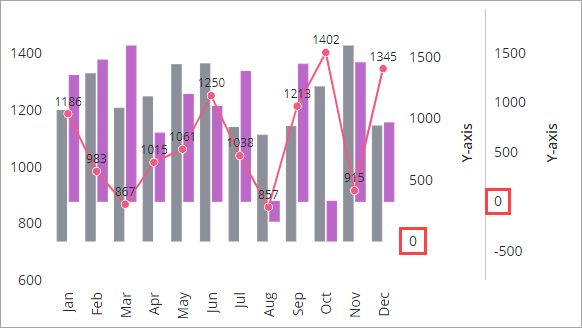
The following image shows the previous chart with the bars aligned at zero.

Displaying Rulers on the Chart
Rulers are thin horizontal and vertical lines that you can add to make the combo chart values easier to read. The Y-axis rulers are aligned with the primary axes on the left by default. You can configure the alignment using the YAxisRulerAlignment property:
• To align the ruler with the primary Y-axis, select Primary Y-axis.
• To align the ruler with the second Y-axis on the left, select Second Y-axis.
You can only align rulers with axes that are next to the data visualization when the chart contains two or more secondary Y-axes on the left. |
In addition, you can display rulers for the zero value of the primary and secondary Y axis, or both using the ZeroValueRuler property. The following example shows a combo chart with rulers that are aligned with the primary Y-axis.

A ruler is used to highlight the zero value of the primary Y-axis. By default, rulers are displayed behind the data. To display the rulers in front of the data, set the RulersInFront property to true.
Grouping and Stacking Data Series in the Combo Chart
You can organize data in the combo chart by grouping and stacking data.

You can stack data series on the combo chart to visualize cumulative data from multiple series. To stack data series on the chart, perform the following steps:
1. In Mashup Builder, select the Combo Chart widget on the canvas or using the Explorer panel.
2. On the Properties panel, set the NumberOfStacks property to the number of stacks that you want to display on the chart.
3. Select the type of visualization that you want to apply to the stack using the StackNCurve property. You can select one of the following options:
◦ Bar—Stacked columns.
◦ Linear—Stacked and shaded lines.
◦ Streamgraph—Shaded lines that are centered around a central axis.
◦ Step—Stacked and shaded step lines.
4. Select the data series that you want to stack using the DisplaySeriesNOn property.
5. Repeat the previous step for each data series that you want to include in the stack.
6. Click Save, then View Mashup.
The data series are stacked. The data series icon is also used to indicate that a data series is stacked.

Displaying Bands for Bar Data
You can display bands to highlight the space that is reserved for categories on the chart. The chart bands are displayed behind column groups on the chart, which makes it easier to view and compare values.

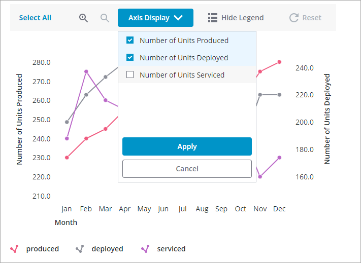
Configuring the Combo Chart Toolbar
You can add the following controls to the chart toolbar to enable users to configure the chart at run time:
• A button to show and hide the legend area.
• A button to select all the data points on the chart or clear all selections.
• Buttons to zoom in and out on the chart data.
• A button to reset the chart to its initial configuration.
• A menu to control the visibility of Y-axes.

The following image shows the previous chart with one Y-axis hidden using the Axis Display menu:
Disabling Legend Grouping
By default, the data series in the chart legend are grouped based on their associated Y-axis. To disable the legend grouping, set the DisableLegendGrouping property to true.