Creating Style Definitions
To apply state formatting, you must create or use existing style definitions for your widgets. You can apply style definitions in one of two ways:
• Creating or using existing style definition entities.
• Create custom style definition within the entity picker. This type of style definition is not saved, and you cannot apply it to other widgets or states. For more information, see Applying State Formatting to Widgets.
To create a style definition entity, do the following:
1. In Composer, click > .
2. Type a name for the entity, and then select an associated project.
3. On the Style Information tab, set values for different style settings such as the primary and secondary background colors.
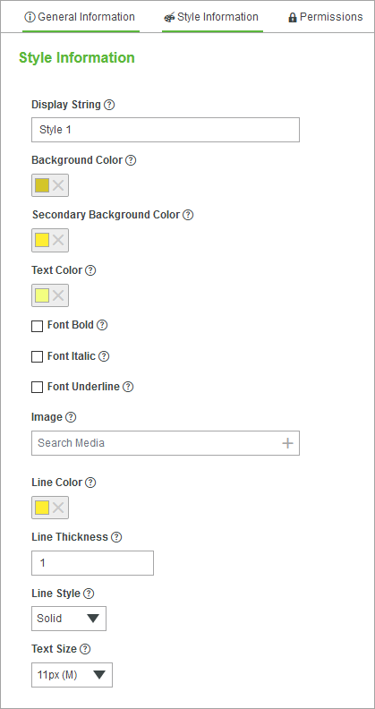
◦ Display String—The name that shows when apply the style definition to a widget.
◦ Background Color—The primary background color of the widget. To display a gradient background for supported widgets, set a value for the Secondary Background Color option. Both color values are used to create a gradient.
◦ Secondary Background Color—A secondary background color that is used for the gradient. To create a solid background color, leave this option empty.
◦ Text Color—The color of text within widgets.
◦ Font Bold, Font Italic, and Font Underline—Style of texts within widgets.
◦ Image—Images that display within a widget.
◦ Line Style—Style of lines displayed within widget elements such as grids.
◦ Text Size—The size of text within widgets.
 | The secondary background color is used to style widgets that support a gradient color. Leave this option empty to apply solid colors. |
4. Click Save.
The style definition is now listed when you create or modify states in Composer and in Mashup Builder.