Item List
Definition and Usage
The Item List reusable component is a contained mashup that lets you display a list of items from a data set in a grid view. It also allows the user to search, sort, and filter the list, and perform actions on the entire list or specific list items.
You can configure the Item List reusable component in the following ways:
• Define the model Thing that provide input to the list
• Enable or disable searching and filtering
• Set the initial filtering and sorting options
• Set the maximum number of rows in the grid
• Set the selection type for the list
• Configure the actions available in the embedded action bar; see the Action Bar for more information
You can filter or search the Item List using the filter drop-down menu or the search box. However, if the filter drop-down menu and the search box are not enabled in the JSON configuration file, then filtering and searching are not available. You can click an attribute name to sort the list by attribute. To reverse the sort order, click the attribute name again.
The Item List reusable component also contains an embedded Action Bar reusable component. By configuring the Action Bar, you can enable additional capabilities, such as executing an action on one or more list items. See the
Action Bar for more information. By default, the Action Bar in the Item List contains an
Export action, which exports all attribute values that match the filter criteria to a CSV file.
The Item List also includes a Restore defaults button. The Restore defaults button restores the default settings for filtering, searching, and grid level operations including sorting, swapping, and showing and hiding columns.
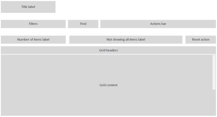
The following is a sample image showing the format of the Item List reusable component:
There are four predefined configurations available for the Item List reusable component: Task List, Affected Items List, Attachments List, and Activity List. For more information on a specific predefined configuration, see its topic page.
Binding Properties
The Item List component has four properties available for binding:
• input— JSON that is the input ID for which data needs to be fetched from the backend system. This information is provided in a CCO (Common Communication Object) format. The keys included in this JSON depend on what data the Item List needs to receive as input. For example, the Attachments List requires different input than the Affected Items List.
• tailoringName— String that is the instance name of the component. It is tightly coupled to tailoring. tailoringName is used to fetch the saved tailoring information for each component.
• totalItemsNumber— Integer that is the total number of list items that match searching and filtering criteria.
• selectedItems— JSON that has a list of selected items in the grid. The following is a sample:
{
"timeStamp":"2019-08-25 18:53:33.476",
"data":[
{
"itemListsData":[
{
"items":[
{
"workItem":{
"value":"OR:wt.workflow.work.WorkItem:143921"
}
},
{
"workItem":{
"value":"OR:wt.workflow.work.WorkItem:143928"
}
}
],
"objectType":"PTC.Workflow.WorkItem"
}
],
"adapter":{
"instanceName":"windchill",
"thingName":"PTC.WCAdapter"
}
}
],
"version":"1.0.0",
"statusMessage":"OK",
"status":"200"
}
Configuration Fields
The following tables show the JSON fields used to configure this component.
Property Name | Description | Type | Default Value | Required or Optional |
maxNumberOfRowsInGrid | Maximum number of rows to display in the grid area. It’s recommended to input a value of 10,000 or less. | Integer | 50 | Optional |
modelThingName | The name of the model Thing that gets the data. | String | PTC.ItemListModelThing. | Required |
label | The title of the Item List. | String | [[PTC.ItemList]] | Optional |
selectionType | Determines how many items in the grid you can select at one time. Available options: none, single or multi. | String | multi | Optional |
waitForInput | Whether to wait for a value at runtime to be passed to the Item List's input mashup parameter before triggering the retrieval of the items that populate the grid. Available options: true, false. | Boolean | false | Optional |
filterFieldID | The ID of the field in backend system to filter by. When blank, there is no option to filter. | MultiValueSelector | N/A | Optional |
filterLabelOverride | A label for the filter which overrides the display value returned from the model. | String | N/A | Optional |
defaultSelectedFilterValue | The initial selected value or values to filter by. When blank, there is no default filtering. | String | N/A | Optional |
defaultSortField | The initial column to sort by. When blank, Item List will be sorted by the first column. | MultiValueSelector | N/A | Optional |
defaultSortDirection | The direction of the default sorting, when applicable. Available options: asc, which indicates ascending, and dsc, which indicates descending. When field is left blank, sort direction is ascending. | String | asc | Optional |
enableSearch | Whether to present the search field. Options: true, false. | Boolean | true | Optional |
findHintText | The hint text shown in the search box. | String | "[[PTC.ItemListFindHintText]]" | Optional |
attributes | Attributes to display in the grid. See the MultiValueSelector documentation for more information. See additional subproperty: | MultiValueSelector | N/A | Required |
fieldTitleOverride | An alternative display name for the attribute, which overrides the field name pulled from the model. | String | N/A | Optional |
showExportAction | Enables or disables the Export action. Options, true, false. | Boolean | true | Optional |
actionBarConfiguration | Configuration of the embedded Action Bar. See the Action Bar for more information. | JSON | N/A | Optional |
modelConfigurations | Entry point for the application builder to pass in additional values to the model, to further customize the component. | JSON | N/A | Optional |
Sample Configuration
{
"modelConfigurations":{
},
"filterFieldId":{
"selectedValues":{
"data":[
{
"itemListsData":[
{
"items":[
{
"id":""
}
],
"objectType":""
}
],
"adapter":{
"instanceName":"",
"thingName":""
}
}
]
}
},
"defaultSortField":{
"selectedValues":{
"data":[
{
"itemListsData":[
{
"items":[
{
"id":""
}
],
"objectType":""
}
],
"adapter":{
"instanceName":"",
"thingName":""
}
}
]
}
},
"actionBarConfiguration":{
"maxItemsToShow":{
"value":2
},
"modelThingName":{
"entityName":"PTC.ActionBarModel.Thing"
},
"actions":{
"selectedValues":{
"data":[
{
"itemListsData":[
],
"adapter":{
"instanceName":"windchill",
"thingName":"PTC.WCAdapter"
}
}
]
}
}
},
"modelThingName":{
"entityName":"PTC.ItemListModelThing"
},
"label":{
"value":"[[PTC.ItemListLabel]]"
},
"showExportAction":{
"value":true
},
"selectionType":{
"selectedKey":"multi"
},
"waitForInput":{
"value":false
},
"filterLabelOverride":{
"value":""
},
"defaultSortDirection":{
"selectedKey":"asc"
},
"attributes":{
"selectedValues":{
"data":[
{
"itemListsData":[
{
"items":[
{
"id":"",
"additionalData":{
"fieldTitleOverride":{
"value":""
}
}
}
],
"objectType":""
}
],
"adapter":{
"instanceName":"",
"thingName":""
}
}
]
}
},
"defaultSelectedFilterValue":{
"selectedValues":{
"data":[
{
"itemListsData":[
{
"items":[
{
"id":""
}
],
"objectType":""
}
],
"adapter":{
"instanceName":"",
"thingName":""
}
}
]
}
},
"enableSearch":{
"value":true
},
"maxNumberOfRowsInGrid":{
"value":50
}
}