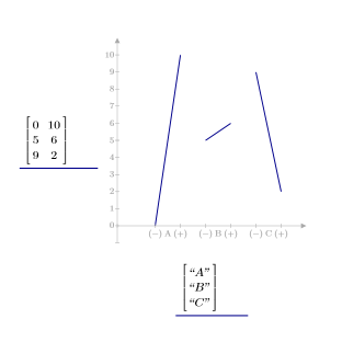
A matrix with two elements per row: the means of the results for the low and for the high values of each factor
x-axis
A column vector of strings representing factor labels
3. Press Enter. A line trace appears.
4. Select the trace.
5. On the Plots tab, in the Traces group, click Change Type. The Change Trace Type list opens.
6. Select Effects Trace. An effects plot appears with a line per factor. The tick marks along the x-axis determine the low (-) and the high (+) average values for each factor.
Additional Information
• You can use the quickscreen function to calculate the y-axis expression.
• When the x-axis expression has only one element, you must enter it as a one-element vector and not as a scalar or a string.
• Each row of the arrays in the x-axis and y-axis expressions represents one factor. To increase the number of factors, add new rows to these arrays.
• For effects plots, the vertical axis only snaps to the ends of the horizontal axis.