Strategy: Displaying Graphs with Logarithmic Scales
The most common reason you switch from a linear to a logarithmic scale is to better visualize graph values for dynamics results. In this case, you need to use logarithmic scales to get an accurate picture of how your model responds to frequency-dependent conditions.
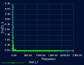
Here is an example of the same graph shown with linear and logarithmic scales. The graph is a plot from a
dynamic frequency response analysis run on a cantilever beam. The graph plots the magnitude of the displacement versus frequency.
In the graph on the left, both the X and Y axes use linear scales. Here all the values are compacted along the X and Y axes, making it difficult to see any changes in the response. In the graph on the right, with logarithmic X and Y axes, you can see much more detail. Here it is easy to see that the displacement varies widely at low frequencies, decreasing smoothly once the frequency increases sufficiently. Logarithmic axes are especially helpful when you plot a very large range of values.
If you decide to return a graph to its original state, use the Format Graph dialog box to re-enter the original settings.


