Results Graph for Selected Stackup
The Results graph depends on the Target Quality defined for the selected stackup.
The graph title contains the stackup type appended with the name of the stackup. The part of the graph that lies within the specification limits is shown in green and the part lying outside the limits is shown in red.
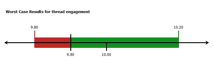
Worst-Case Results Graph
The nominal stackup value and upper and lower specification limits for the stackup appear at the bottom of the Results graph, which is defined in the Objective. For unilateral specifications as shown in the image, in which the results must be greater than 9.90, only one specification limit is shown.
The numbers at the top of the graph indicate the upper and lower limits of the stackup at the Worst-Case Target Quality. These limits are shown as vertical green or red bars.
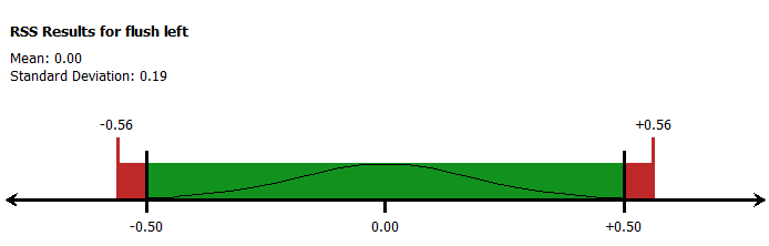
RSS Results Graph
The RSS Results Graph is similar to the Worst-Case Results graph with the following exceptions:
• The normal curve within the rectangular section of the graph indicates the statistical nature of the analysis.
• The calculated mean and standard deviation parameters for the RSS component of the results are shown above the graph.
The nominal stackup value and upper and lower specification limits for the stackup appear at the bottom of the Results graph, which is defined in the Objective.
The numbers at the top of the graph indicate the upper and lower limits of the stackup at the RSS Target Quality. These limits are shown as vertical green or red bars.
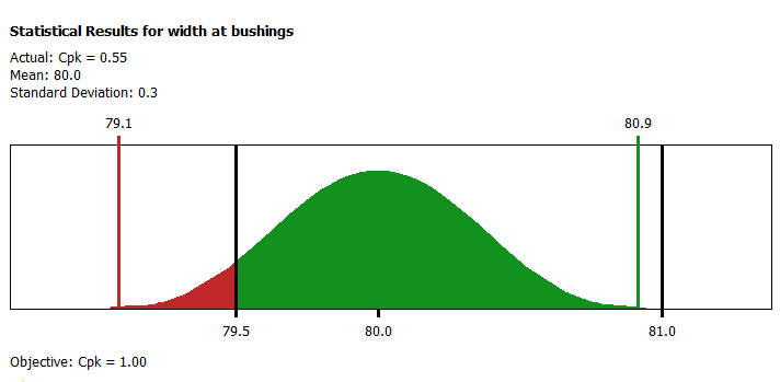
Statistical Results Graph
The Statistical graph is of the shape of the probability density function, which is associated with the Gaussian or Normal distribution. It is referred to as a bell curve.
The desired Target Quality metric and value appears at the bottom of the graph. The predicted quality level based on the percentage of the curve falling outside of the upper and lower speciation limits is at the top of the graph. In addition, you can see the calculated mean and standard deviation parameters for the distribution.
The numbers on the top of the graph represent the upper and lower calculated limits of curve at the specified target quality level listed below the graph. In this example, the quality is Cpk of 1.0.